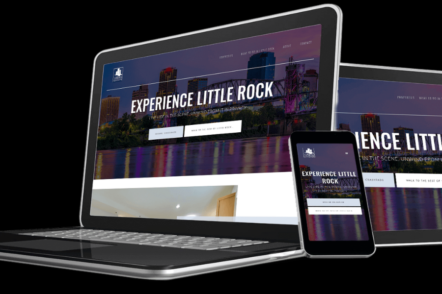
Web design has become a fundamental aspect of building websites. When put into perspective, web design refers to the visual aspect and design elements of a website. These elements are what users interact with when they visit a site. Most websites are built to be interactive; when you think about it, social media is built on excellent web design. It keeps the users engaged and is very simple to understand and follow.
What makes a good web design?
There a few principles to follow when it comes to website design. It may all seem simple and even common sense, but not everyone seems to get it. Designing a website is an art form that relies less on technical ability and more on one’s intuition and the ability to anticipate a user’s thought pattern. Let’s explore some examples of good website design.
Maintaining the user’s concentration – A website’s usability should be straightforward and maintain the user’s focus by keeping them engaged. The site’s navigation should work seamlessly with the user’s intent by keeping information visible and easy to find. The user wants things to be easy. When they think of something to do i.e., fill a contact form, that should be easy to find and not a hassle.
Don’t test their patience – When you visit a website, and there are all these things popping up in front of you, asking for your information or requiring you to complete tasks before you can move on, how does that make you feel? I bet not good. Your patience runs thin, and you’re about ready to leave. Similarly, when designing a website, you should keep things to a minimal. Let the user visit and explore the site without being bombarded with too much information.
Center their attention – The goal is guiding the users from one point to another with ease. There things that naturally pull our attention like pictures and highlighted texts. You can use this to influence the user experience and keep them engaged. Providing incentives can significantly impact their experience, which is done by selecting the right words to use and placing them at an easily observable point on the website. An example is providing an email address in exchange for a free download.
Don’t complicate things – keeping the design as simple and straightforward as possible will guarantee excellent user engagement. There might be all these fancy things you learned in design school that you’d love to try, but the truth is that it may not resonate well with the user experience. Social media is an excellent example of how keeping things uncomplicated gets the job done. When you log in to Twitter or Instagram, you see everything immediately. You know where your home button is; you know where the timeline is, your inbox, and so on.
Try it out quickly and frequently – As with any product design, before launch, it is imperative to test it and get feedback on what works and what doesn’t. This practice gives you a good idea of what the user experience will ultimately look like.
Web design is a fundamental aspect of any business in the digital space. When done right, it can be the difference between a few sales and a lot of sales. There are some Austin web design companies with functional web design layouts that offer these services to individuals and companies. No matter how you choose to do it. Designing your website the right way will undoubtedly take your business to the next step.


