
Typography is one of the most important decisions you will make for your brand. The fonts you choose don’t just display words; they spell out the personality of your brand and affect how the audience feels toward your business. From the elegance that a serif font, such as Garamond, infuses into a style to the modern feel of a sans-serif, like Mont, typography will dictate how others view your brand.
But with so many fonts available, how will you know which one best fits your brand identity? This guide includes a strategic approach to selecting fonts that best represent your brand values, resonate with your target audience, and deliver readability across all mediums.
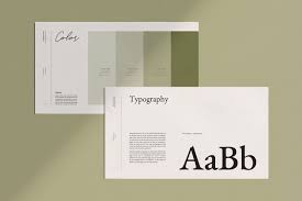
Understanding the Psychology of Fonts
In fact, every font expresses a personality and communicates a particular emotion. That’s why typography isn’t just about style but about brand communication. You can take the example of serif fonts.
Garamond is seen as traditional, trustworthy, and elegant, which explains why industries like finance, banking, and luxury fashion have widely adopted this type of font. Sans-serif fonts like Helvetica represent modernity, simplicity, and minimalism, fitting well for technology brands or startups that wish to appear clean and professional.
Choosing a font that resonates with your audience can be the key to creating an emotional connection. Coca-Cola’s script, for example, evokes feelings of nostalgia and traditions.
Or how about LEGO’s bold sans-serif script, shouting volumes about playfulness and imagination? The direct link between fonts and consumer perception suggests that brands should choose fonts that align with their values and audience expectations.
Aligning Fonts with Your Brand Identity
When choosing the perfect font, it needs to reflect and bring out your brand’s core values. For example, if your brand speaks luxury, serif fonts like Didot, which brands like Vogue and Armani use, would suit it better.
Brands that wish to look modern and chic could opt for sans-serif fonts such as Avenir and Montserrat.
It’s not just about perception; these fonts also create cohesion across various touchpoints to ensure your brand remains cohesive, whether in print or digital.
Secondly, the target should also be considered when choosing the main font: playful, creative companies communicating with younger consumers would look casual and friendly using a handwritten or script font like Pacifico or Brush Script.
Serif fonts could be used by a legal firm or any financial institution to show professionalism and reliability.
Functionality: Readability across platforms
Aesthetics are important, but functionality plays a great role, too. So, the most crucial selection criterion when choosing a font is legibility, especially when you have a brand presence across different platforms, from print to digital.
Sans-serif fonts, such as Roboto or Arial, work much better on screens because of clean lines, hence making them ideal for websites and mobile apps. This is to ensure that your fonts will be readable on every device, not affecting the user experience.
Every time you select a font, check its appearance on various devices and sizes. For example, thin, elegant fonts look perfect on a high-resolution display but may completely blur out on a small screen.
That’s where scalable and responsive typography becomes invaluable. Thanks to responsive web fonts, your brand’s typography will easily adapt to all different screen sizes without sacrificing quality.
Pairing Fonts for Maximum Impact
Pairing fonts is a good way to create contrast and engage the reader without overwhelming them. A very common approach is to use a serif font for headings and sans-serif for body text.
For example, Baskerville (serif) paired with Arial sans-serif balances formality and readability. This approach will enable the brand to take its audience through the content using a clear visual hierarchy and ensure that the key messages stand out.
Font pairing is another method for adding depth to your design. Most importantly, it is better not to overuse it. You should not use more than two or three fonts; otherwise, your design will start looking messy and disconnected.
Now, keep this simple: use one font for headings, one for body text, and one for accents such as callouts or buttons. This format will keep the design clean and professional while leaving room for creativity.
Trends in Typography: 2024 and Beyond
Typography is constantly changing. Keeping up with the trends will always keep your brand fresh and relevant. Of course, one of the major trends to watch out for in 2024 is the resurgence in serif fonts.
Once known as old-school fonts, serifs are returning because they bring elegance and readability even in digital spaces. Brands that want to project timelessness or heritage increasingly turn to serifs to set themselves apart from the sea of minimalist sans-serifs that have dominated the past decade.
Custom Fonts
Another emerging trend is custom fonts. More and more brands are commissioning the design of special typefaces that represent their particular identity. Of course, with custom fonts, businesses can create a distinctive visual voice, guaranteeing that nobody in the market looks, or even feels, like them.
For example, companies such as Airbnb and Netflix have designed their fonts themselves to ensure a consistent brand identity across all platforms.
Geometric Fonts
Geometric fonts are also in trend. These fonts, with clean and mathematical shapes, convey a feeling of modernity and precision. They are a perfect fit for tech companies or minimalistic brands. Examples include Futura and Niveau Grotesk, both very professional but with a modern feel.
Licensing and Legal Considerations
Not only do you have to consider the look and the feel of a font when you choose it, but you should also focus on its licensing. Many fonts are copyrighted, and using them without a valid license will get you into trouble.
Free, open-source fonts, such as Google Fonts, can be an extremely economical solution but may not be unique, which is why designers often choose premium or custom fonts.
For brands interested in investing in an identity that is unique, consider buying the license for a font or commissioning a custom typeface.
Conclusion
Typography is crucial in building your brand identity because it can make all the difference regarding how your audience will perceive and feel about your business. An appropriate font does not just add beauty to your brand’s look; rather, it speaks volumes about its values and personality.
You can select typography that elevates your brand by first considering the psychological effect of different font styles, ensuring readability on every device, and keeping up with the latest trends.
Whether it’s the traditional sophistication of a serif or the sleek modernity of a sans-serif, the idea here is to tie the fonts back into your core message and audience. Contact Toni Hukkanen to get the perfect typography solution that has much more to do with being the voice of your brand rather than just letters on a page.
Stay in touch to get more news & updates on Glamourcrunch!